Website Design Trends for 2024
Good website design lies in the details – the subtle and often overlooked elements that impact aesthetics, functionality, and usability work together to elevate the overall user experience. They range from thoughtful use of white space for better readability, to subtle changes in color, shadow, or scale when a user hovers the cursor over interactive elements.
Website design, like any other creative realm, has its fads and fashions, which come and go, and its useful innovations and long-term trends, which have staying power. Which design elements will rule in 2024?
Here’s a look at what we expect to see!
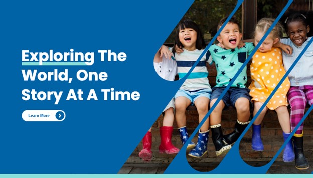
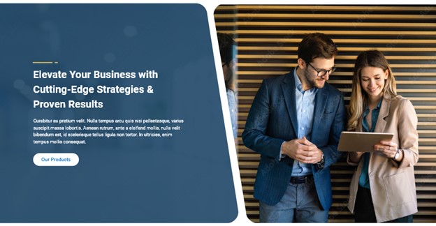
Split the Image
This entails breaking a single image into smaller shapes that are closely placed together, maintaining the recognizability of the image content despite its fragmented structure. Such an approach can captivate users' attention and contribute to a design that is both dynamic and intriguing.
Design by Northwoods
In the example above, the angles of the unique, interesting shapes guide the eye to the text content and the “learn more” call to action.
This effect carries some risks for images in which human faces are prominent. A bisected face can attract negative attention and make it appear disjointed or broken. In this instance, the faces remain intact, except for the girl in the yellow dress. Her lowered gaze diminishes any adverse impact on the overall design's effectiveness.
Design by Northwoods
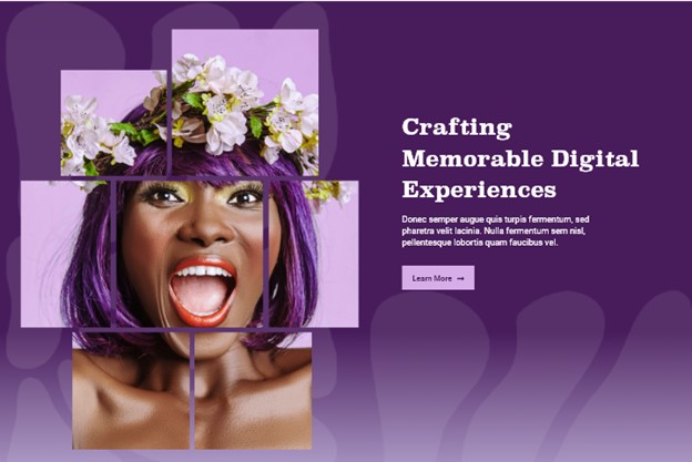
In the example above, diverse rectangle sizes contribute to an asymmetrical design that, despite its unevenness, maintains a sense of balance. Breaking the image into smaller shapes not only generates interest but also elevates an already impressive image, making it even more memorable and compelling for visitors.
Before
In the content shown above, there is white text with a basic purple background and a single photo. This layout, though functional, is a case study in common, uninspired design. It lacks the distinction needed to make a lasting impression.

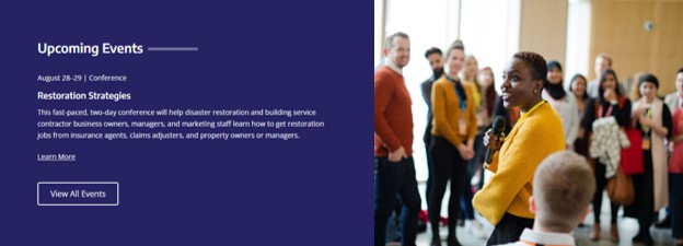
After
I employed the same stripe but altered the image by segmenting it into rounded shapes. This effect draws more attention to the speaker, who serves as the focal point of the image.
Unconventional or attention-grabbing shapes pack powerful visual impact, appeal to users, and promote engagement. They play especially well in such crucial sections as landing pages and banners. Unique shapes convey a sense of creativity and innovation, breaking away from traditional design norms. This signals to users that the brand or website is forward-thinking and dynamic.
Bold Shapes
Bold shapes deliver an instant visual punch. They seize the attention of visitors and make a powerful first impression. These shapes also lend themselves to layered, dimensional designs that add depth and visual intrigue to the layout.
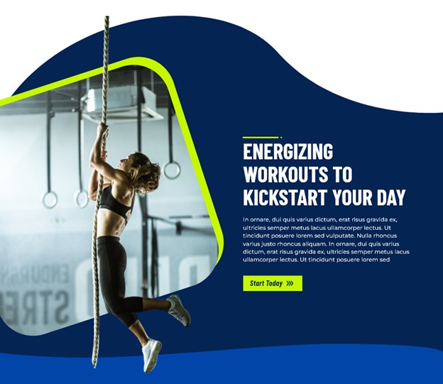
In the example below, various shapes harmonize seamlessly. Two wave shapes – one small and light blue, the other large and darker blue – adjoin like puzzle pieces to form the background. A tilted square with rounded corners serves as a window into a photo of a gym.
The focal point of that photo is a woman climbing a rope. Her feet and the tail of the rope dangle outside the window, into both background wave shapes. It’s clever, it’s fun, it’s on-brand. And it’s far more engaging than common boxy grid layouts.
Design by Northwoods
Bold shapes are not always visually loud or overwhelming. They can be subtle and sophisticated which works better for certain brands.

Design by Northwoods
The example above shows how bold shapes, when applied with elegant simplicity, can make a substantial impact on the design. The strategic use of negative space contributes to a more pleasing and user-friendly experience. Zero visual clutter invites users to concentrate on the primary content or message. The bold, sweeping gesture within the prevailing minimalism strikes a balance that captures and sustains user interest.
Textures
Texture adds depth to an otherwise flat, forgettable appearance. A vast array of available textures offers endless opportunities to make your website design stand out. Textures can evoke emotions; for instance, a soft, smooth texture can convey comfort; a rough texture might suggest ruggedness.
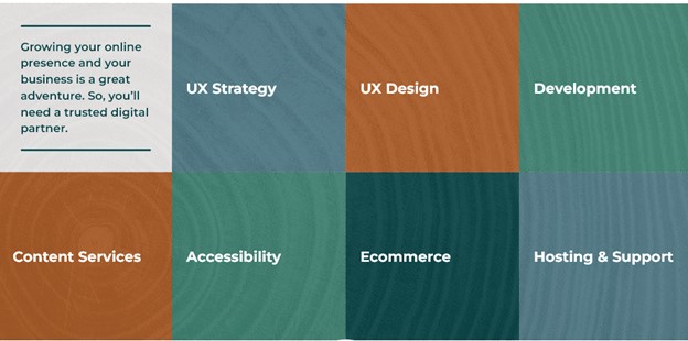
Design by Northwoods
In our newly updated Northwoods website design, we sought the seamless integration of textures behind our hover cards, as shown above. The tree ring pattern symbolizes longevity and resilience. This suggests that our brand has a solid history and continues to grow steadily – we’re here for the long run. Additionally, the association with wooded northern Wisconsin conveys that our brand is down-to-earth, genuine, and authentic.

Design by Northwoods
Bold shapes are just part of the story of the above example. It also incorporates texture to add excitement and depth into the design. The texture serves as a background for the overall website; it subtly emerges behind images, shapes, and content.
The chaotic and dynamic essence of the splatter or spray-paint-like texture carries an edgy vibe that fits unconventional or alternative brands. Textures, like brands, have personalities; it's crucial to align them with the overall theme, target audience, and brand personality. Make sure that they resonate with the intended message and brand image.
Cohesive Imagery
This trend is back to basics: more emphasis on cohesive imagery.
Maintaining consistency and curating thoughtful imagery lends a professional touch that makes a favorable initial impression on visitors. High-quality, uniform images not only elevate the website's professionalism, they also build user trust and entice visitors to dive deeper into the content. Beyond aesthetics, imagery plays a pivotal role in storytelling. Good images strengthen emotional connections between users and your brand or message.
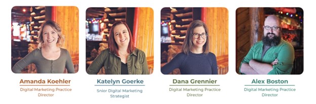
Design by Northwoods
Team photos, as shown above, hold great opportunity for image cohesion. Consistency in team photos presents a polished appearance, which reflects positively on the professionalism of your team and organization. A consistent photo style and background visually unify a team that comprises diverse members.
Image consistency says this about your company’s ethos: All our team members matter to our organization, and as professionals, they strive to serve clients, customers, and one another well.
Design by Northwoods
Transforming your entire image collection into black and white, as shown above, is a great way to instill cohesion. Black and white helps smooth over images that are spotty or inconsistent in color, lighting, or tone. The straightforward nature of black and white imagery nurtures an aesthetically clean website design. Viewers can concentrate on the content and message presented in a clearer and more straightforward visual experience.
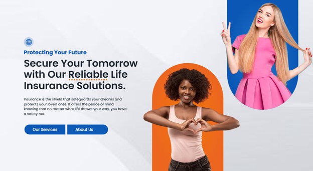
Pop-Out Effect
The pop-out effect creates the illusion of a person emerging -- popping out -- of a shape. The designer either crops the individual from the original image background or seamlessly integrates the background into the shape.
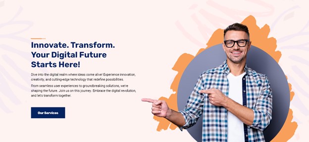
Design by Northwoods
People are drawn to human faces; incorporating images of people into your design is a powerful way to boost user engagement and prolong time on your website. The pop-out effect amplifies this attention by directing the viewer's focus even more toward the faces or individuals featured in your design.
Design by Northwoods
Careful selection of photos of individuals who resonate with your users is a pivotal aspect of this website design trend. Your images should mirror the diversity, values, and experiences of your target audience, and help establish your site as a relatable and inclusive online environment.
Faces that reflect users’ backgrounds, lifestyles, and aspirations cultivate in those users a heightened sense of belonging with your brand. Curating visual content with this in mind not only enriches the user experience but also communicates a powerful message: Your brand comprehends, respects, and values diversity. This intentional approach to image selection contributes to a more emotionally resonant and engaging online presence. It fortifies the bond between your brand and its audience.
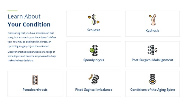
Customize Your Icons
Customized icons – in contrast to generic or standard icons – infuse your brand's distinct identity and personality into the user interface. Icons that match your brand's color palette, style, and overall aesthetic contribute to a unified, memorable design.
Design by Northwoods
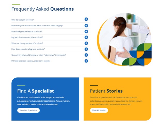
Icons can be vibrant design elements. Colorful icons are compelling alternatives that add visual appeal without disrupting a clean design. Beyond serving as eye-catching focal points, these icons efficiently convey information. They are particularly beneficial with complex topics, such as medical terms (as shown above), where finding suitable imagery might pose a challenge.
Design by Northwoods
Integrating gradients into icons can bring depth, dimension, and a modern feel to a website’s design. Specific gradient styles, particularly those featuring bold and vibrant color choices, can contribute to a futuristic or high-tech aesthetic that aligns with certain brand narratives.
This approach works best with bright, vibrant colors. Poorly executed gradients can quickly make a website design feel outdated.
Design by Northwoods
Customized icons can highlight unique features or products within your industry, as shown above. The hand-drawn icon style has an organic quality often associated with eco-friendliness. This association aligns neatly with eco-friendly brands and products.
Line Art
Line art refers to two-dimensional images crafted from simple lines, without color or shading. It appeals to those who appreciate clean, straightforward website design.
Design by Northwoods
The simplicity of this technique, counterintuitively, often adds elegance and sophistication to your design. That is, less is more; every design personality does not have to be an in-your-face personality in order to succeed.
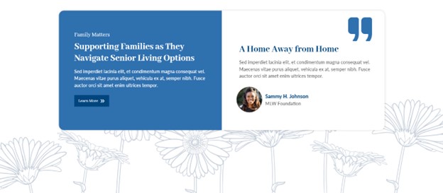
We created the example above for a senior living website, and the line-art floral background was added because flowers are commonly associated with wellness and healing. The imagery aligns seamlessly with the promotional focus of many senior living centers.
Design by Northwoods
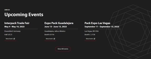
In the example above, we added some cool geometric line art. Geometric shapes often contribute to a modern and contemporary aesthetic. The line art at the right-hand side of this content adds a subtle, up-to-date sophistication to the design. It also relates to the underlines that separate the event dates and locations in the text, to unify the look.
Rounded Corners
Rounded corners convey a softer and friendlier aesthetic than sharp angles. This creates a more approachable and inviting design. This website design trend is notably effective in industries where a warm and welcoming interface is essential, such as in e-commerce, hospitality, or community-based websites.

Design by Northwoods
In the example above, the impact of the image's rounded corners is heightened by the two-colored, strategically offset shapes behind it. This application further “rounds-off” the square.
Design by Northwoods
The versatility of rounded corners opens creative possibilities, as shown above. For example: Round corners applied selectively, perhaps on just a couple of corners of a card, introduce a subtle, yet telling, variation to the overall visual composition.
Design by Northwoods
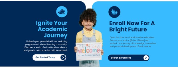
In specific scenarios, as demonstrated above, rounded corners can add a whimsical touch that matches a brand that seeks a friendly and approachable tone. Some school websites, for example might target audiences that appreciate a casual and creative atmosphere. Rounded angles subtly contribute to a site that extends a warm welcome to students, parents, and educators.
Design by Northwoods
Substituting angular edges with curved corners, as shown above, not only creates a more approachable and welcoming design but also serves to temper the assertiveness associated with sharp angles. Combining the precision of angles with the fluidity of soft curves can result in a harmonious blend that strikes a balance between structure and warmth.
Keep a look out for many of these website design trends to pop up in 2024. We’re excited to see how they and other trends unfold!
Are you planning to redesign your website soon? Let Northwoods’ expert web and UI/UX designers ensure your site matches and enhances your brand, meets your users’ needs, and helps you achieve your goals. Reach out to us today for a consultation!
Good #websitedesign lies in the details – the subtle and often overlooked elements that impact aesthetics, functionality and usability – that work together to elevate the overall #userexperience. https://nwsdigital.me/46ZzEUe @northwoods #webdesigntrends #uxdesign