Web Design Trends for 2023
A beautifully designed website makes a good first impression – and that’s just the beginning. It raises your brand’s credibility. It enhances user experience. It makes visitors more likely to engage with your site and return to it.
Given the importance of your website, it’s wise to keep up with design trends. Here's a look ahead to the fresh designs of 2023 that can set your site apart from the competition.
Incorporate Organic Shapes
Straight lines and right angles are easy: Make boxes, insert content.
Straight lines and right angles are also, well, boxy and generic. And boring.
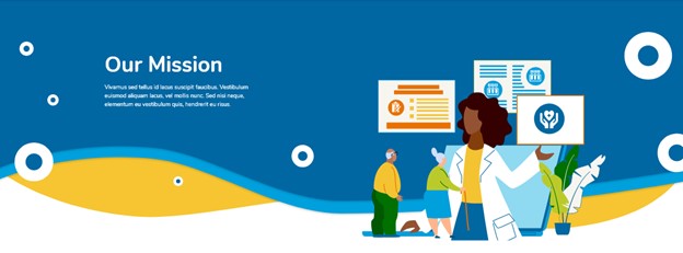
Avoid severe lines and instead play with curves, waves, swooshes, blobs and other organic shapes. They will automatically boost your site’s curb appeal and help you stand out from your competitors. Such shapes can provide visual cohesion and continuity and simply make your site more stylish and contemporary.
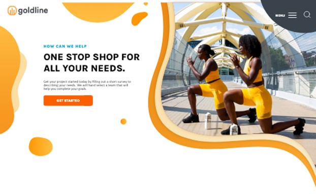
Design by Northwoods
The organic shapes and bright colors mix well in the example above to create a fun, exciting layout.
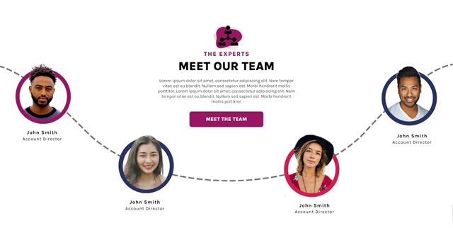
Try Asymmetrical Design
In asymmetrical layouts, designers intentionally skew visual elements, to direct user attention to the most important areas of the design. Asymmetry naturally creates a sense of movement, and it works well with organic shapes, as in the example below.
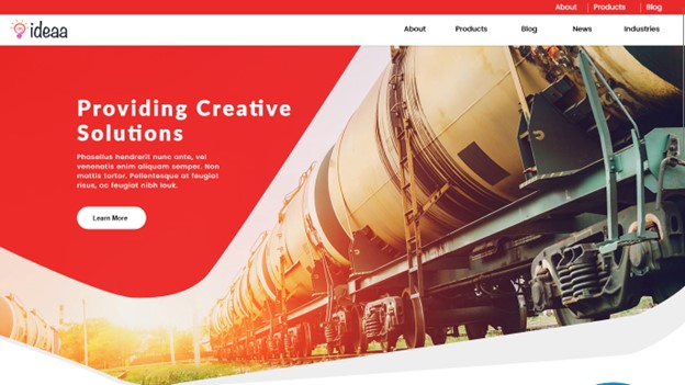
Design by Northwoods
However, “asymmetry” does not mean “unbalanced.” The overall design should still feel balanced and visually appealing; it takes a discerning eye to find the sweet spot. But done right, asymmetry can make your website feel more energetic and fluid.
Design by Northwoods
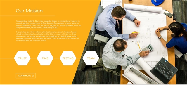
Use Bold Colors
All websites need a healthy amount of white space, but it need not be white. Any color or pattern can serve as blank or empty screen. Painting bold, vibrant colors into such regions is an easy way to instill design personality. The strong contrasts that bright colors can provide enhances accessibility and makes it easier for users to perceive and distinguish various segments of content.
Bright colors can work as solid backgrounds or as part of a gradient. Either way, users will notice a bright color palette; consistent use of that palette in your overall brand identity and on your site can raise brand recognition.
Design by Northwoods
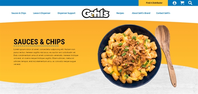
In the example above, the gradient flows from orange to yellow. These bright colors work well for the Gehl’s brand and don’t distract from the imagery. Note that gradients need not be linear. Designers can blend three to five colors for a more fluid gradient.
In the example below, vibrant blues and oranges form the background, and they recur in the illustration. Illustrations further enhance the color palette of a website’s design. Designers can edit them easily to perfectly match any desired color palette.
Design by Northwoods
Small strokes of bold color colors can also have strong impact. In the example below, we added bold purple and blue borders around the images. Bright purple carries through the icon, header, and button. This more subtle approach to color enlivens a simple layout.
Design by Northwoods
Think Outside the Frame
The image above is also a great example of our 2023 trend: Editing photos or illustrations to pop out of the frame. Unique contours add interest to boring images and basic shapes. They create an illusion of depth and put more focus on the primary subject matter of the image.
Northwoods created the graphic below for Office Furniture Resources. The focal point is the red chair, which dips below and above the circular red frame, an arrangement that results in interesting contours and contrasts.
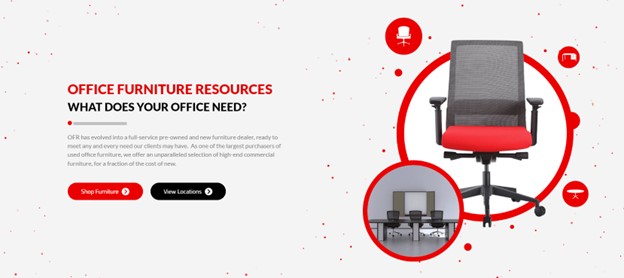
Design by Northwoods
You don’t have to use an image with a transparent background to make this effect work. We edited the image below to highlight the semi-truck. The truck portion of the image dips below the frame of the banner to capture user attention.

Design by Northwoods
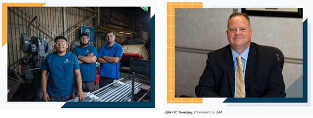
Use Pictures of People
People like to connect with other people, so include pictures of your people in your designs. Caution: Users will spot stock photography and perceive it as fake. Photograph real people from your company, retain the original image backgrounds, and don’t over-edit to make the images appear too photoshopped. And, of course, publish images that are high quality and in focus.
Authentic photography helps users connect with your brand on an emotional level. It makes your organization more approachable, credible, and trustworthy. Those three qualities promote customer engagement.
Design by Northwoods
Northwoods was lucky enough to work through a rebranding project with Powerbrace. As part of rebranding, they took new photos of their employees to display on their website.
Create Image Collages
Creating great images for your website isn’t easy. But if you’re lucky enough to have a robust image library, those images can be re-used in new, key roles in your design.
Image collages can convey an organization’s culture in a single glance, as shown in the collage below, for a university website. Prospective students can connect with such graphics and get excited to be part of this collegiate community.
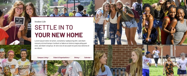
Design by Northwoods
Image collages can vividly capture and communicate the atmosphere of an event, as in the example below, which we created for Milwaukee Irish Fest. At a glance, users grasp the energy and excitement of Irish Fest more vividly than they would through text alone.
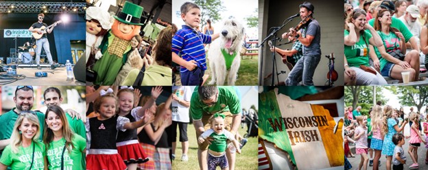
Design by Northwoods
Expect the Unexpected
You can rebel against website norms in small ways to make your website stand out. For example: Subtle movements of content, often triggered by hover effects. In the example below, an image appears in the background when a user hovers over the card element. Users would expect a card design such as this to involve a simple color change or underline. An image that runs counter to typical user experience can create a memorable, delightful surprise.
Design by Northwoods
Thoughtful User Experience Is Key
The design trends you choose for your website should support your brand strategy and enhance user experience. A high design website that’s hard to use or navigate isn’t worth the headache you’re causing your users – or the potential negative impact to your brand.
Your website design should intrigue, engage, and delight your users, and thus leave them with a positive, memorable experience.
Are you considering a website redesign this year? The expert design team at Northwoods is here to help! Reach out to us to learn more.
Website design trends should support your brand strategy and enhance #userexperience. A high design website that’s hard to use or navigate isn’t worth the headache you’re causing your users. https://nwsdigital.me/3hbC66h @northwoods #websitedesign #webdesigntrends