Design vs. Content: Where to Start?
Website design is visually stimulating and engaging. It’s fun to watch website designers get creative as they figure out how to represent your brand digitally, but it’s also easy to forget that design and content need to work together. While you should definitely enjoy the dazzle of design, make sure to maintain focus on content, too.
The Content-Design, Design-Content Conundrum
Designers typically prefer having content in hand before they start the design process. This helps them understand how content elements should work together. It also helps them determine where, when and how to encourage site visitors to act, and what their actions should be. Ultimately, prior understanding of content helps designers create seamless paths that guide users through websites to their desired destinations.
Content developers, ironically, often prefer to start with the design. The design-first approach gives content writers a visual representation of the content they must develop and an idea of how it will fit into the website that’s under construction. Sometimes content creators manage to follow the constraints of the design; sometimes, designers must change their schemes to accommodate unforeseen content.
So which approach – content first or design first – makes the most sense?
Benefits of a Content-First Approach
A content-first approach prevents issues that can result from altering content in order to conform to the design. This practice can lead to inconsistent brand messaging. In the content-first approach, content guides – rather than conforms to – design, leading to a better user experience.
Here are a few additional reasons a content-first approach makes sense:
Problems With Placeholder Text
A designer with little or no actual content in hand must work with placeholder content, such as lorem ipsum. Designers use this popular text to temporarily fill the gap of missing content and, thus, keep on working. On the downside, lorem ipsum is meaningless. It fails to clarify the relationship between content and design as the site is built, and that can lead to problems.
Website designers can format meaningless placeholder copy however they please. Naturally, they cut or expand it to make the design look perfect. When real content comes into play very late in the process, suddenly nothing seems to fit.

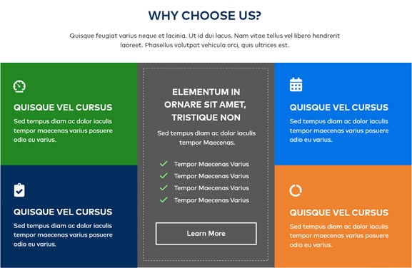
A grid design filled with lorem ipsum placeholder text. The text in the colored boxes is identical in length, which makes the grid feel balanced and complete.

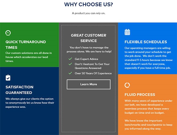
The same grid design with actual content. Varied lengths of content create awkward spacing in the middle panel and throw the colored squares off balance. The much shorter sub-head above the grid makes that space appear incomplete and empty.
A More Efficient Process
Pre-written content prevents misunderstandings that can lead to surprises in page layouts or design. It heads off the expense and time of design adjustments to accommodate content that doesn’t fit within the constraints of the template. These updates may be small, but they can add up. Again, they can take you off message if you end up degrading carefully crafted copy to make it fit a box in a template. The alternative – altering or scrapping design elements – also costs time and money.
Stronger Design
Pre-established content generally leads to better-looking websites. The content tells designers where they need to create flexibility – because, say, content and/or media change frequently – and where they can be more strict with the design.

An example of a simple two-column layout. But what happens with only one card? With three cards? How will these changes affect the design? How should the design adapt?

In the single-card adaptation, the card widens slightly and centers below the heading. The two-column layout would have left the right-hand column as an empty, awkward white space. Users could reasonably conclude that something is broken or missing from the website.
Content that is locked in or not likely to change allows web designers more creative breadth. They don’t need to worry about designing for variation; instead, they can focus on beauty, visual messaging, and brand enhancement.

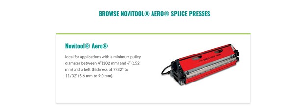
This example comprises seven content sections. When users hover over any given section, that section highlights and grows larger. For this design to work, each of the seven areas of content must link to detail pages and each section must lead with a great image. Content within the boxes must be concise; long page titles would not work with this design.
Benefits of a Design-First Approach
Content development takes time. Not every company has content writers on staff to get content ready to go before the website design process begins. Often, content develops in tandem with the design. But too often, content comes after the design is complete.
Design-first does have some upsides:
- First, it helps content writers structure their content development. They take comfort in knowing, say, exactly how long titles should be and the word-count limit on sections. Such limits can curb verbosity and incline writers toward digestible, easily scanned snippets of content. That makes site visitors happy, as it helps them quickly identify the content they need and get to the pages where that content resides.
- Second, content developers can see page layouts before they begin writing and can write to fit.
Even so, final content has a way of not quite fitting despite best intentions; generally, minor layout or design adjustments will be needed to avoid breaking the design. If you do start with design, keep the designer involved all the way through the final copy tweaking.
Ultimately, Design & Content Need to Work Together for Better UX
Content must lean on design just as much as design must lean on content. In both the site-building process and in the fully formed, operational site, the two elements must mesh to provide the best possible user experience.
Don’t wait until the final stages of the project to bring the two together. Here are some tips to make content and design a fluid, interactive process:
- Open lines of communication right away. Get web designers, content writers, and strategists together early in the process.
- Avoid lorem ipsum. When possible, design with actual content.
- Establish a general idea of content. If no content exists at the start of the project, work with the strategy team and content writers to establish the general idea of the copy and elements planned for the website. Develop a heading structure together to begin to shape the pages.
- If you have early content drafts, use them in your prototypes. No need to wait for finalized copy when prototyping.
- Design for flexibility for content that you know will be dynamic. Blogs, for example, vary in length, imagery, number of authors, etc. Make sure the design template accounts for these variations.
Subscribe to our blog for regular website design, content strategy and development tips, insights and trends. If you need help with a website redesign project right away, don’t hesitate to reach out!
Content that is finalized allows web designers more creative breadth. They don’t need to worry about designing for variation and instead can focus on beauty, visual messaging and brand enhancement. https://bit.ly/3Fm1iNi @northwoods #websitedesign #websitecontent


