The Importance of Website Design for SEO Optimization
Your website is the bedrock of your brand’s online presence. It makes the first impression on visitors who seek to learn more about a brand or business. A good web design builds trust with these visitors and helps elevate them to customers.
Design matters. Thoughtful layout enhances users’ experience by guiding them seamlessly and intuitively through a website. This positive experience makes your brand more memorable.
Good design also matters with non-human site visitors: the web crawlers that index your site and drive your position on search results pages. Let’s take a closer look at the impact of design on search engine optimization.
Designing Headings for SEO
Headings break up intimidating blocks of text and organize content to make it more scannable for users. Web crawlers, too, find good heading structure attractive; headings are critical elements of SEO. Search engines, like humans, use headings to quickly crawl through websites to better understand their content. Once a search engine understands the content for each page, it better understands where and when to rank your site in search results.
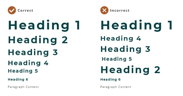
Each page should have a single H1 and subheads in a sequential, descending order that doesn’t skip any levels.
Heading design is an important component in making sure that content managers stick to the hierarchical arrangement. Link the heading size to the hierarchy: H1s should be larger than H2s, H2s should be larger than H3s, and so forth. Make heading size match the content. For example, large H1s can be great for short headings, but won’t work as well for longer content.

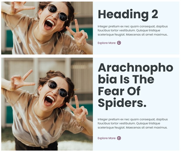
In the example above, the large heading size works for shorter headings. However, for the longer heading it can be overwhelming, and the first word doesn’t fit on one line.
Heading design is an important component in making sure that content managers stick to the hierarchical arrangement. Link the heading size to the hierarchy: H1s should be larger than H2s, H2s should be larger than H3s, and so forth. Make heading size match the content. For example, large H1s can be great for short headings, but won’t work as well for longer content.

In the example above, the large heading size works for shorter headings. However, for the longer heading it can be overwhelming, and the first word doesn’t fit on one line.
Content managers might be tempted to use an H2 instead of an H1 in the example above, because a smaller H2 would be a better fit. But that wouldn’t be good for SEO. The solution: Design a smaller H1 to accommodate longer headings. Or find a way to deliver the message in fewer words.
Good Web Design Can Help with Dwell Time
Search engines tend to conceal the algorithms they use to rank websites. But, surely, dwell time – the time a user spends at a webpage before jumping back to the SERP – plays into it.
Search engines want to give searchers the most useful and relevant results possible. Dwell time indicates the utility of a given result. If a user clicks on the top result and then quickly jumps back to the SERP and clicks on the next link, the first result didn’t help that user. If a user spends five minutes reading the content of the second result listed, the second result likely aligns more closely with the user’s search needs.
As stated earlier, website design forms the user’s first impression of your brand. A bad first impression prompts the user to click back to the SERP. A good first impression encourages the user to allot more time to finding what they seek on your site.
A visually pleasing website promotes users’ confidence in your content, which causes them to stick around a little longer, which in turn lifts your SEO. So quality imagery, good page layout and typography, modern design elements and so on pay off in more than one way. Those design elements must also be scannable, so users can find the information they want without reading every word on the site.
Clean, clearly labeled navigation can attract users to identify further areas of your company’s expertise – and that builds engagement and trust, increases dwell time, and improves SEO.
Mobile Design Is Good For SEO
Mobile friendliness matters for SEO. Search engines can detect mobile devices, and they assign higher results priority to mobile-friendly websites. Of course, higher placement in the search results raises your website’s ability to generate traffic and leads.
Responsive design – as opposed to a separate app for a mobile audience – is the most common method of creating a mobile-friendly website. Responsive designs adjust content to fit screen size. Many designers now think mobile-first, but this approach doesn’t make sense if 90% of your users come to you via desktops. We always urge our clients to understand their users before jumping straight into the design phase. Sometimes a mobile-first design isn’t appropriate, but you’ll always want to make sure that your website looks good and functions well on mobile screens.
Here are a few important mobile website design tips:
- Design for tapping. With both apps and responsive design, a website that is truly friendly to mobile devices involves more than merely confirming that content adapts to the width of the screen. Mobile users have no mouse; they interact with the design entirely with their imprecise fingers. Links and buttons must be larger for users to effectively tap them. General rule: make the tappable area 44 x 44px.
- Reconsider background videos in the mobile setting. It might be wise to replace them with static images, so mobile users don’t waste data and time downloading videos that are more decorative than informative. Optimize image sizes for speedier performance, or even remove them entirely from the mobile design if they break up the content unnecessarily and don’t add value beyond decoration.
- Consider adapting the heading size for mobile devices. This is especially important if they are very large on desktop. On mobile devices, too-large headings break up content at awkward points.
A Faster Design For Better SEO
Page speed is widely considered one of the leading SEO ranking factors. Impatient users expect websites to load within seconds, and they tend to go elsewhere when faced with a slow site. Improve speed by contracting with a good host and enabling browser caching.
Design matters in speed, too:
Images
- Make sure images are optimized for the web. Select an appropriate file type and size, and reduce the DPI. Printing of images requires a DPI of 300, but a DPI of 72 is almost always enough for web.
- Avoid degrading the images as you optimize. Small, pixelated images will hurt your overall brand and design and make a bad impression on users.
- As mentioned earlier, use images more sparingly on mobile. If an image disrupts the content and provides no useful information to the user, remove it from displaying on mobile.
- If the site design uses many large images, train content managers to routinely optimize images.
Video
- Uploading videos to YouTube and then pulling them onto your site is a great way to improve site speed. However, hosting videos on your own domain can be better for SEO. Users searching for your company could end up directly on your YouTube channel as opposed to your website. This might not matter much to some businesses, but it’s something to consider for yours.
- Set a fallback photo as a placeholder in case problems arise in uploading video. If you do have problems, users won’t see the video. They’ll just see a nice picture.
- Be cautious with video on mobile. Background videos should be exchanged for images, and informative videos should not play automatically.
- Consider compression tools. Some available tools don’t degrade the quality of the video.
- Check your site’s speed. Optimizing images and videos across the design will speed up your site.
Bonus Tip: Don’t forget to add meta descriptions to your images and videos. They help search engines scan and index these media formats.
If you need help optimizing your website for better SEO performance, the expert digital marketing and website design teams at Northwoods are ready to help you reach your digital goals! Contact us here.
A visually pleasing #website promotes users’ confidence in your content, which causes them to stick around a little longer, which in turn lifts your #SEO. https://bit.ly/3aIaoKM @northwoods #webdesign #websitedesign #SEOtips


