Why a Strategic Approach to Visual Brand Identity Matters
Updated: Jan. 3, 2023
Originally Published: June 29, 2001
A strong brand identity should permeate every aspect of a business. It should influence how everyone from execs on down think about their products and services and how they conduct business. It should inspire and shape how marketers talk and write about the business on everything from broadcast media to press releases to social media to blog posts ... and more. And it should also guide the company’s visual elements, which play a key role in branding.
A truly effective brand identity aligns all these elements to form a clear, distinct idea of the business, an idea that plays not only in the market, but also within the company’s walls.
But in this post, I’ll focus on the visual elements — logos, colors, design, fonts, photography, imagery, iconography, etc. — and the importance of developing a strategy to align them with your overall messaging, to make them consistent, so as to make your brand identifiable — and desirable — at first glance.
Visual Brand Identity Helps You Stand Out
Your company’s visual brand identity is critical to your ability to help customers and potential customers recognize and choose your products and services in a highly competitive and crowded marketplace. Consider these sobering statistics:
- It only takes people an average of 7 seconds to form an impression of your brand. (Forbes)
- 55% of brand first impressions are visual. (U.S. Chamber of Commerce)
- Consistent presentation of a brand across platforms can increase your revenue by up to 23% on average. (Forbes)
- Color raises brand recognition by up to 80%. (University of Loyola, Maryland)
Smart marketers understand that crafting effective, strategic visual brand identity takes a mix of both art and science.
Visual Brand Identity Evokes Emotion
A solid brand strategy leads to a brand identity that represents your company’s unique personality. Your visual branding can prompt the positive emotions you want customers to feel.
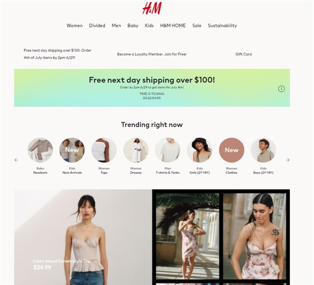
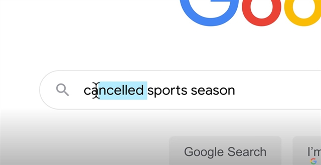
One size doesn’t fit all; visual branding (like branding in general) should be unique to your company. Is your brand personality hip and trendy yet practical, like H&M? Forward-thinking and modern, like Google? Outdoorsy and adventurous, like REI? Each company presents a specific visual brand identity that matches its personality and values and speaks to its audience.

H&M's brand identity portrays the company as hip and trendy, yet practical.

REI's brand identity is designed to appeal to people who are adventurous and love the outdoors.

Google's visual brand identity is modern and forward-thinking. In this screen grab from one of Google's TV ads, you can see that only a partial logo is shown - the full logo isn't needed for viewers to know exactly who the ad is for.
Your brand identity should likewise evoke specific feelings for current and potential customers and support their perceptions of and aspirations for themselves. Your ads, your packaging, your color palette, your logo, your buildings, your vehicles and so on should spark a positive emotion in anyone who sees them.
But does this actually work when it comes down to buying decisions?
Picture yourself searching for pasta at your grocery store. You’ve got lots of options!
The only way to distinguish among them at first glance is visual brand identity — logos, colors, fonts, designs.


Which of these pasta brands would you pick off the shelf?
Few people will buy on brand identity alone; many variables factor into every purchase. Here in pasta land, though, buyers might:
- search out the cheapest option.
- want to enhance cred as a gourmet cook.
- want a pasta that incorporates spinach or carrots for color and a bit of nutrition.
- only eat organic.
- need a gluten-free option.
- have recently seen a commercial for a particular brand and want to try it.
- have tried a brand before and had either a good or poor experience.
Even within these narrowing criteria, options exist, and packaging and design can play a big role. Buyers might pass on reading ingredients or other label copy and reach for the most appealing design based on how the design makes them feel. And that design might not always relate directly to the product.
- A buyer inclined toward the latest trends might go for a sleek, modern design.
- A more simple, traditional design - one that goes back decades - might trigger just-like-mom-used-to-make nostalgia.
- Beautiful, hand drawn images of grains with soft, natural colors may appeal to someone who wants to be perceived as elegant and refined or a believer in natural foods.
Seem a little crazy? Next time you’re out shopping and you pick a product off the shelf — even a product as simple as pasta — ask yourself, Why this one? Or, consider why you always shop at the same clothing store. You’ll probably find that careful price/quality/quantity analysis did NOT drive your purchase. It’s more likely that the product or merchant appealed because of a correlation with how you think of yourself and how you want others to perceive you.
Savvy brands and their marketers know this. Through brand strategy development, they understand their core strengths and values, what appeals to their ideal customer, and how to message effectively to build affinity. They also know, through strategic brand identity and messaging, how to evoke the emotions that create strong positive associations with their brands.
First Strategy, Then Consistency
We’ve established that highly effective brands approach brand identity strategically. But is that all that’s needed to succeed? Nope!
Think of hugely successful, strategic consumer brands like Apple and Nike, or Target and Anthropologie. What do they have in common? Striking, recognizable, consistent visual brand identities.
Every ad, regardless of medium (TV, print, digital, outdoor), for any of these companies is immediately recognizable, regardless of the product being touted and usually even before a logo is displayed. That’s the power of consistency coupled with a strong visual brand identity. Strategy is Job No. 1, but once you’ve created your brand identity, consistent application is critical to making it stick as a highly recognizable, stand-out brand.
Final Thoughts
Your visual brand identity should grow organically from your overall brand strategy — which in a profound way is based on who you are as a business. Only after you’ve determined that will you have enough insight to develop a persuasive, memorable visual look and feel that leads to increased sales, greater brand affinity and long-term growth.
Need to better define your brand strategy or rework your brand identity? Northwoods can help! Contact us today.
Savvy brands & marketers know how—through strategic visual brand identity and messaging—to evoke the emotions that create strong positive associations with their brands. https://nwsdigital.me/3i7qVMx @northwoods #brandstrategy #brandidentity


