Optimizing Image Sizes On Your Website
Choosing the perfect images for your website is half the battle. The other half involves optimizing those images to give users the best possible experience.
When sites load slow, the first thing we look into is image optimization. Especially as your site evolves over time and image content changes, it’s easy for content authors to lose sight of how well image size and quality is managed.
Images and impact, your biggest asset
The strategy for the launch of your new (or redesigned) website should include a conversation about performance. While performance, or the perceived speed of your website, should always be good, there is a trade-off between super-speed and the inclusion of large and/or plentiful images.
Aesthetically pleasing visual design and compelling photography lead to happy users, return visits to your site, and conversions. Visual design and imagery correlate directly to your brand impression and credibility. They also make your site slower than it would be without them.
Images and page speed, your biggest threat
High-quality images bring obvious benefits, but large, uncompressed images slow down the loading of your site and degrade user experience and brand impression. The trick is to find the sweet-spot between the two competing interests with image optimization.
Image optimization is paramount
Image optimization must be a conscious and continuous component of your web content workflow, but there is no single correct way to optimize images. Optimization factors include file type, compression, pixel dimension, quality, content of encoded data and vector vs raster, among others.
Optimization and file types: Where to begin
If you don’t have access to Adobe Photoshop, many online tools, some of them free, are available for image compression.
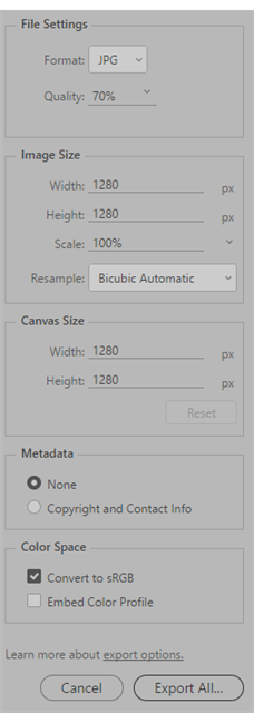
With Photoshop, we recommend that you save/export your photographic images as jpg files optimized at 60-80% quality. Choosing to minimize the included metadata (see below) will also be beneficial. File types like png, gif and svg are best for other types of graphics that require scaling, animation, transparency or less color variation.

The image dimensions, width and height, are also important and can vary depending on the demands of your visual design. Your CMS should automatically create a set of multiple image versions at various sizes on upload, configurable to support your design. When you create content pages, it’s important to be mindful of selecting the right image size so you’re not asking the user’s browser/device to download an image file that is larger than is required. Ask us about how to automate this image selection process to ensure your site performance is high and user-centered.


