Should I Consider Large-Scale Displays When Redesigning My Website?
Updated: April 22, 2024
Originally Published: Nov. 14, 2022
What Is a Large-Scale Display?
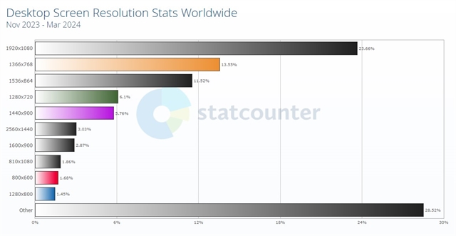
Common large-scale screen widths are 1360, 1440, 1536, and 1920 pixels. Modern web design typically accounts for all these sizes.
Recently, though, we’ve seen even wider screens, especially 2560px, more and more often. These larger screen sizes are sometimes referred to as 4K, or Ultra-High Definition.Who Is Using Large-Scale Displays?
Browser stats for the United States show screen sizes wider than 1920px are still under 3% of desktop resolutions in use, and global stats are even lower. But smart TVs and UHD screens are growing in popularity, and people are browsing the web on them. Expect that to become a trend.
How Do People Use Large-Scale Displays?
Monitors with large screens and high resolutions are great for maximizing productivity. They offer more screen real estate for multitasking. Users can spread out windows and applications for simultaneous use. All wide-screen monitor users aren’t looking at your website in full-screen.
That’s a good thing!
Most websites aren’t optimized for full-screen displays. Many are fixed at a specific maximum width in the middle of the screen. Some stretch content in unnatural ways to fill the expanse, which creates difficult-to-read text area widths and blurry images or images that don’t scale to fit. On high-resolution monitors, text can become too small to read or content might be packed too densely.
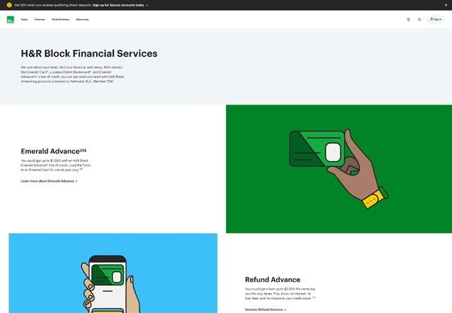
Scaling can become problematic on large-scale and 4K displays when sites aren’t designed specifically for them. In this example from H&R Block, the site stretches to fit the screen width, but the text doesn't adapt, leaving large gaps of white space between elements.
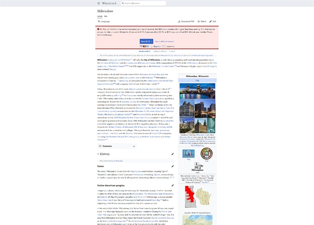
When not designed specifically for large-scale or high-definition 4K displays, website content is often constrained to a center column with lots of white space on either side, as in this example from www.wikipedia.com. This center column maintains a consistent user experience to the 1920px monitor, with text blocks that maintain readable widths and image/text interactions that remain in sync.
Should I Redesign My Website for 4K Monitors?
Will users benefit from a display maximized for large screens? Ask yourself these questions:
- Do your site visitors use large-scale devices? Google Analytics can show you the screen sizes of your current site visitors.
- Do you have adequate budget for design, development, and testing to optimize for large-scale displays? Rule of thumb: Add 10% to the project cost, but costs will vary depending on project scope.
- Do you have scalable graphics, images, and media assets to support large-scale design? Can your team manage the creation of additional sizes, assets, and optimization work going forward?
If the benefit is clear, proceed with thoughtful planning. Designers and developers can create unique designs for large-scale displays that deliver optimal user experience on very large screens. Include a large-scale comp or prototype from the start, and use it for testing designs throughout development.
On mobile devices, site developers tend to stack content and add columns of content as screens grow to large tablet and desktop sizes. As screens get extra large, designers must choose to stretch content or add more columns, and that choice is never simple. It can turn on the specifics of the displayed content and on the design and branding.
Options for typography are also limitless as screen sizes grow. Rather than add more columns, developers can choose to upscale content so that it fits the space proportionally, as done for smaller screens.
Final Thoughts
Adoption of Quad HD (2560×1440) and Ultra HD (otherwise known as 4K, 3840×2160) displays are on the rise. If you’re planning for the future and have the necessary budget, it’s smart to include large-screen layouts in your design and development. However, not all organizations have the resources to design for large-scale displays today. For now, that’s OK. But, in a few years you'll definitely want to budget to accommodate them.
If you’re looking to redesign your website and have questions about designing for large-scale displays or need design assistance in general, our team is here to help! Reach out to us anytime.
Adoption of #4K displays are on the rise. If you’re planning for the future and have the necessary budget, it’s smart to include large-screen layouts in your #websitedesign and development. https://nwsdigital.me/3E8hzHs @northwoods #websitedevelopment #websiteredesign


